UI Inspiration
6
min read
Discover top course website designs with great UX and educational structure.

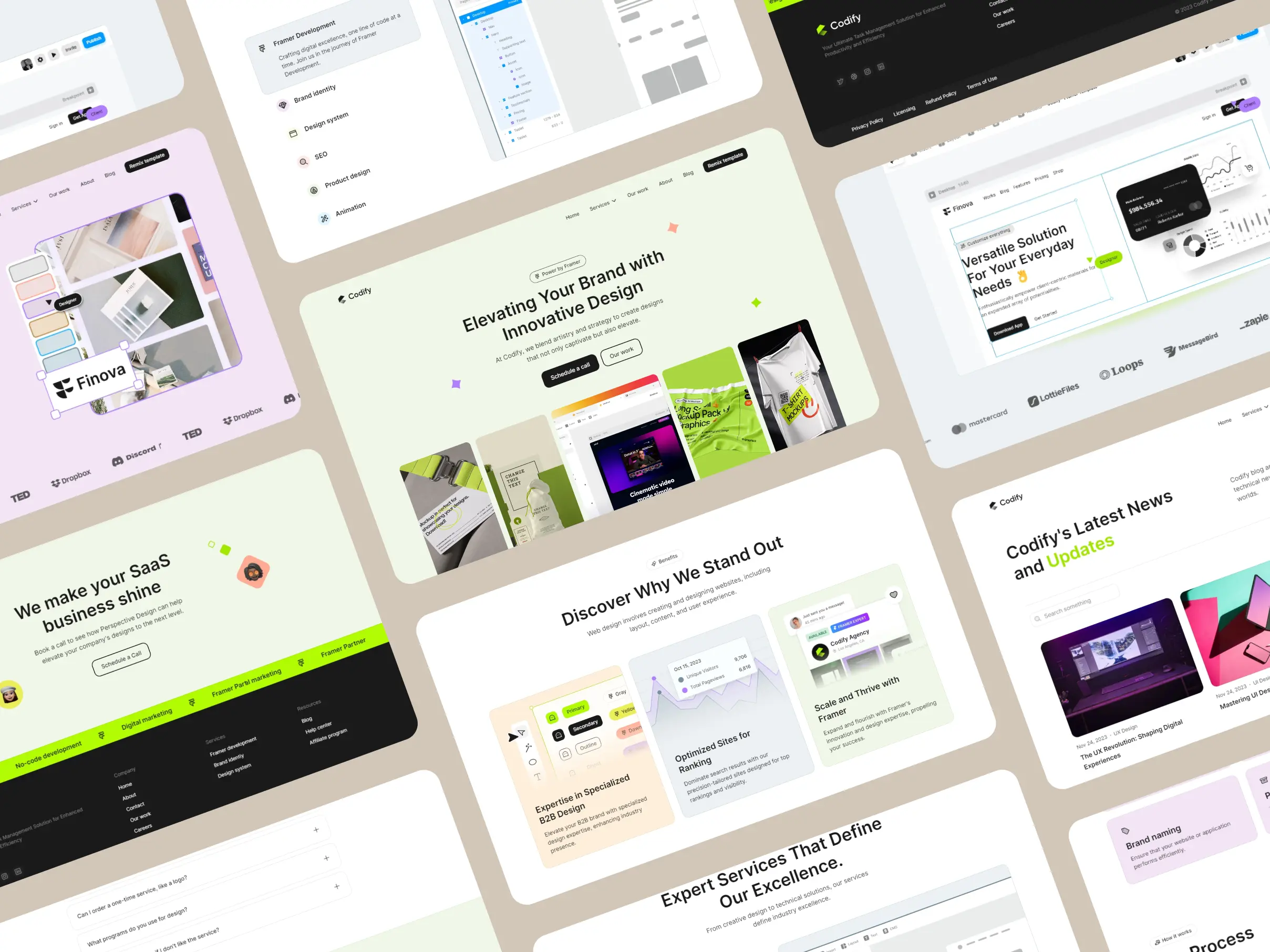
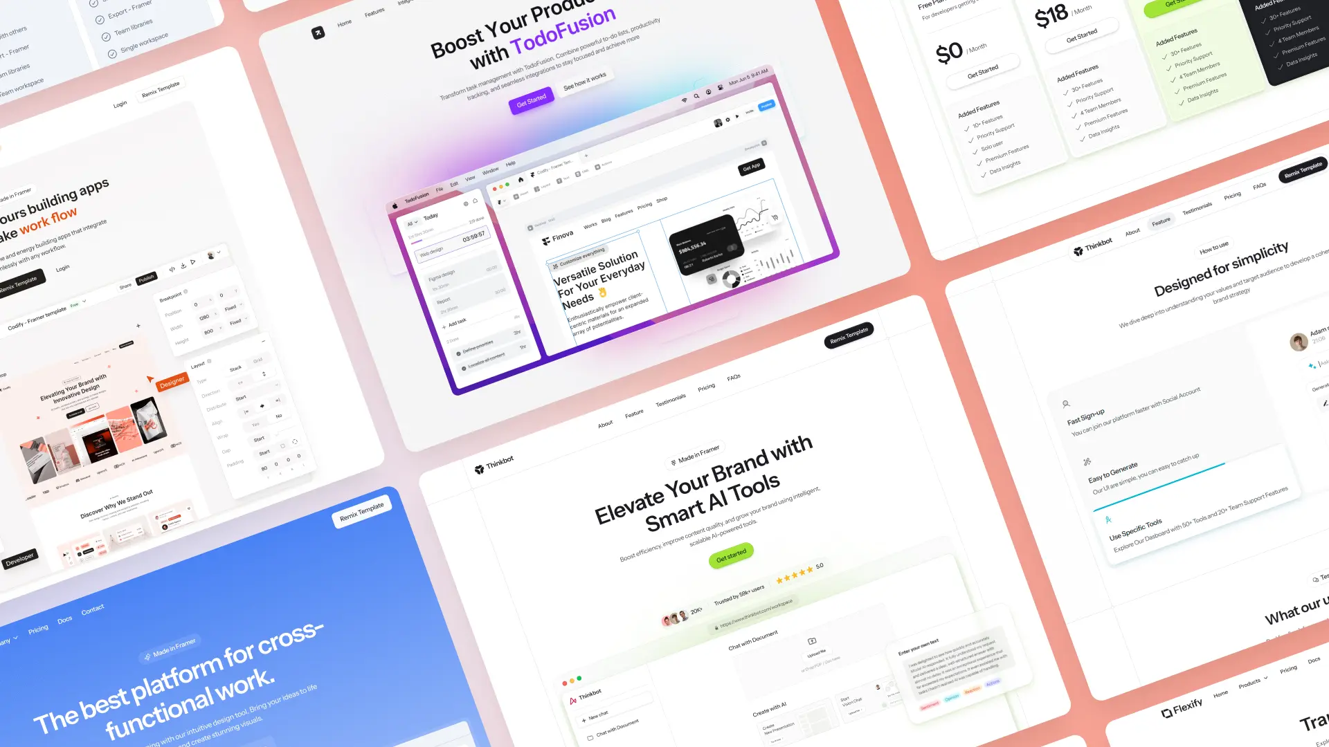
In today’s fast-evolving online education landscape, your platform’s design can be the deciding factor between trust and bounce. Great course websites don’t just look good — they convert visitors into engaged learners by providing clear structure, strong hierarchy, and thoughtful UX decisions. Whether you’re building your own course site or just gathering inspiration, the examples below showcase the most refined and effective course platform designs to date.
What You’ll Learn from This Guide
Whether you're building your own course site or refining an existing one, this guide will give you clear, practical insights into what works best in modern course platform design. You’ll walk away with:
Key UX and layout patterns that successful platforms use to boost course signups
Real-world inspiration from both global giants and personal brand course creators
Visual and structural elements that create trust and reduce bounce rates
Design ideas that work equally well for individuals, educators, and startups
A clear understanding of how templates like StudyFlow can save time and money
Ways to structure course information for better clarity and easier navigation
Examples of high-converting homepages, landing flows, and pricing sections


Final Thoughts
A well-designed course platform not only presents your content beautifully but also builds trust, clarity, and conversion. Whether you're creating your first online course or scaling your business, great design is what keeps users engaged. If you're looking for the fastest, easiest way to launch your own high-quality course website, StudyFlow is the tool we recommend. It’s powerful, elegant, and ready to use.

Stay informed with the latest guides and news.