Top 20 Fonts for Modern Web Design 2026
Top 20 Fonts for Modern Web Design 2026
UI Inspiration
7
min read
A curated list of versatile fonts perfect for digital interfaces and branding.
In this article
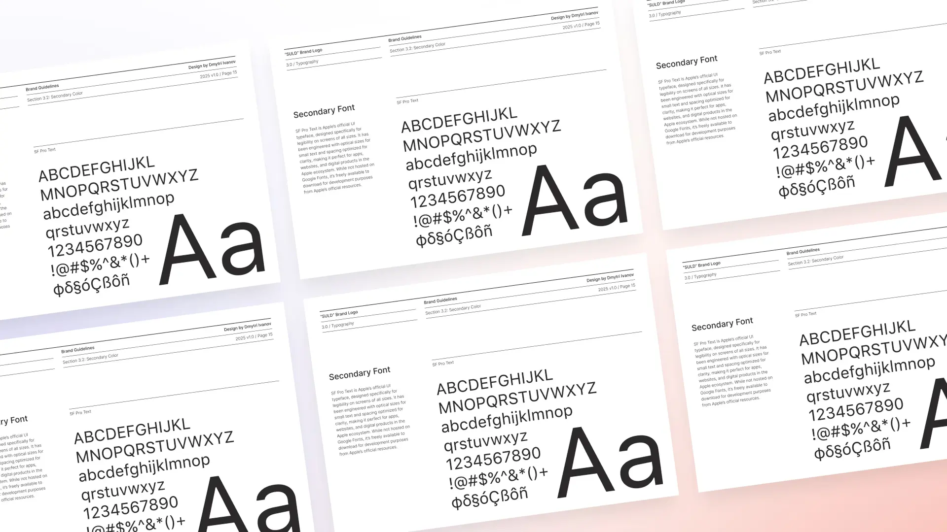
Typography is more than just letters — it's a foundational element that defines tone, legibility, and overall user experience. In 2025, modern web design demands typefaces that are not only beautiful, but also flexible, accessible, and performance-optimized.
Why Fonts Matter in 2025
Whether you're building a personal portfolio, a SaaS landing page, or a digital magazine, choosing the right font is a design decision that impacts how users perceive your brand.
In this post, we’ve curated 20 of the most popular and effective fonts used by designers in 2025. These fonts are selected for their visual clarity, modern aesthetic, and proven use in real-world projects.
Let’s explore the best fonts to elevate your web design.

1. Inter
Where to get it: Google Fonts
Inter is a workhorse sans-serif font designed specifically for screen readability. With strong support for multiple weights, open letterforms, and excellent spacing, it’s become the go-to choice for UI designers building accessible interfaces. It’s widely used in dashboards, apps, and product UIs — including platforms like Linear and Vercel.

2. Satoshi
Where to get it: Fontshare
Satoshi is a modern geometric sans-serif that blends minimalism with personality. Clean yet characterful, it's ideal for both headlines and body text. Thanks to its sharp terminals and spacious counters, it’s become a favorite in modern landing pages and digital brands.

3. General Sans
Where to get it: Fontshare
General Sans offers a friendly, slightly humanist take on the classic grotesque genre. Its subtle curves and fluid rhythm give it a natural reading experience, making it ideal for editorial sites and personal portfolios. It’s especially popular among designers who want a more approachable, less sterile sans-serif.

4. Plus Jakarta Sans
Where to get it: Google Fonts
Originally designed for the Jakarta government’s branding, this typeface has grown into a web design staple. Plus Jakarta Sans features clean lines, geometric forms, and a confident presence on screen. Its versatility makes it perfect for SaaS websites, mobile apps, and modern startups.

5. Geist
Where to get it: Vercel
Geist is a clean, neutral sans-serif created by Vercel — used across their own platform and now publicly available. It combines modern typographic proportions with excellent legibility, making it ideal for developer tools, documentation sites, and highly functional interfaces.

6. Instrument Sans
Where to get it: Google Fonts
Instrument Sans is a modern sans-serif developed by Instrument and prominently used in Framer’s own branding. It features wide letterforms, tight spacing, and geometric elegance. Though not officially available for public download (yet), its appearance in countless Framer projects and mockups has made it one of the most desirable typefaces in modern UI design.

7. Space Grotesk
Where to get it: Google Fonts
Space Grotesk brings a futuristic feel to classic grotesque typography. With distinctive character shapes and generous spacing, it works well in tech-focused interfaces and creative studio websites. It’s especially effective for brands that want to appear cutting-edge yet grounded.

8. DM Sans
Where to get it: Google Fonts
DM Sans is a low-contrast geometric sans-serif that’s optimized for legibility at small sizes. Its rounded terminals and clean curves make it a safe and accessible choice for interface design, especially in mobile or dashboard environments.
8. DM Sans
Where to get it: Google Fonts
DM Sans is a low-contrast geometric sans-serif that’s optimized for legibility at small sizes. Its rounded terminals and clean curves make it a safe and accessible choice for interface design, especially in mobile or dashboard environments.

9. Manrope
Where to get it: Google Fonts
Manrope is a highly versatile sans-serif font that supports Latin and Cyrillic characters. Its neutral tone and wide letterforms make it well-suited for both headings and long-form text. Brands seeking simplicity and universality will find it a powerful tool.

10. Outfit
Where to get it: Google Fonts
Outfit is a typeface from the team at the Foundry that created the “Outfit” project. It’s minimalist, soft, and approachable, making it an excellent font for lifestyle brands, portfolios, or any UI that aims to feel human and warm.
10. Outfit
Where to get it: Google Fonts
Outfit is a typeface from the team at the Foundry that created the “Outfit” project. It’s minimalist, soft, and approachable, making it an excellent font for lifestyle brands, portfolios, or any UI that aims to feel human and warm.

11. Be Vietnam Pro
Where to get it: Google Fonts
Be Vietnam Pro is a versatile and modern sans-serif typeface developed for Vietnamese language support, but it works beautifully in global designs. Its tall x-height, open letterforms, and strong rhythm make it ideal for UI, mobile apps, and startups that need both functionality and style.

12. Urbanist
Where to get it: Google Fonts
Urbanist is a modern, clean, and geometric sans-serif font designed for digital interfaces. With wide support for variable weights, it offers flexibility across UI elements — from large hero text to microcopy. It’s quickly becoming a favorite in modern startups and design systems.

13. Epilogue
Where to get it: Google Fonts
Epilogue is a variable sans-serif font with a contemporary character and excellent versatility. Its low-contrast design and crisp edges make it ideal for UI layouts, digital branding, and editorial interfaces. With a wide range of weights and clean rhythm, Epilogue works beautifully from headings to microcopy.

14. Suisse Int’l
Where to get it: Swiss Typefaces
Suisse Int’l is a professional-grade typeface used in high-end branding, editorial design, and tech products. Its wide range of weights and refined spacing make it a favorite for design systems and complex interfaces.
14. Suisse Int’l
Where to get it: Swiss Typefaces
Suisse Int’l is a professional-grade typeface used in high-end branding, editorial design, and tech products. Its wide range of weights and refined spacing make it a favorite for design systems and complex interfaces.

15. Archivo
Where to get it: Google Fonts
Archivo is a grotesque sans-serif designed for high-performance typography. Originally intended for editorial use, it works equally well in modern UI design. With its tall x-height, solid rhythm, and extensive weight options, Archivo offers a strong visual structure for both headlines and dense text blocks.

16. Cal Sans
Where to get it: GitHub
Cal Sans is an open-source font created by Cal.com. It features wide proportions and confident strokes, making it a great fit for bold headings, hero text, and brand slogans.
16. Cal Sans
Where to get it: GitHub
Cal Sans is an open-source font created by Cal.com. It features wide proportions and confident strokes, making it a great fit for bold headings, hero text, and brand slogans.

17. Barlow
Where to get it: Google Fonts
Barlow is a low-contrast, slightly rounded sans-serif family designed for maximum clarity across digital interfaces. With its approachable geometry and wide range of weights, it adapts well to everything from navigation systems to marketing sites and product UI.

18. Public Sans
Where to get it: Google Fonts
Public Sans is a clean and neutral sans-serif typeface developed by the United States Web Design System. Designed for accessibility and legibility, it’s ideal for government, fintech, and enterprise websites that prioritize clarity and trust. Its professional tone makes it a dependable choice for structured design systems.

19. Red Hat Display
Where to get it: Google Fonts
Red Hat Display is a geometric sans-serif designed with tech culture in mind. It balances personality and professionalism, making it ideal for open-source projects, tech startups, or documentation sites.
19. Red Hat Display
Where to get it: Google Fonts
Red Hat Display is a geometric sans-serif designed with tech culture in mind. It balances personality and professionalism, making it ideal for open-source projects, tech startups, or documentation sites.

20. Work Sans
Where to get it: Google Fonts
Work Sans is a flexible sans-serif inspired by early grotesques. It's optimized for both desktop and mobile devices, and performs especially well in UI-heavy environments like web apps and dashboards.
20. Work Sans
Where to get it: Google Fonts
Work Sans is a flexible sans-serif inspired by early grotesques. It's optimized for both desktop and mobile devices, and performs especially well in UI-heavy environments like web apps and dashboards.
Final Thoughts
Choosing the right font is one of the most impactful decisions you can make in web design. From functional UIs to expressive portfolios, typography shapes how users experience your brand. This curated list gives you a solid foundation — now it’s your turn to experiment, combine, and find the right voice for your next digital project.
Want to explore web design templates that use these fonts beautifully? Check out Stylokit.com for premium Framer templates crafted with typography and usability in mind.
Written by

Dmytri Ivanov
Writer
Latest Articles & Guides
Latest Articles & Guides
Stay informed with the latest guides and news.


One Payment. Lifetime Access.
Unlock every Stylokit template — present and future — with a single purchase. No subscriptions, no limits. Just clean, high-converting designs built for speed.
Insert
Layout
Text

Invite
Publish
Stylokit
stylokit.com
Pages
Layers
Assets
Home
Search
Desktop
Primary
Main
Hero section
Logo cloud
Feature
CTA
Testimonials
Pricing
Newsletter
FAQs
Tablet
1199-810
Phone
809-0
Lifetime access. No subscriptions.
Link
Link to
Page or URL...
Position
Type
Relative
Size
Width
1fr
Fill
Height
800
Fit
Min Max
Add...
Layout
Effects
Overlays
Cursor
Size
Opacity
1
Visible
Yes
No
Overflow
Hidden
Radius
1
Border
Add...
Shadow
Add...
One Payment. Lifetime Access.
Unlock every Stylokit template — present and future — with a single purchase. No subscriptions, no limits. Just clean, high-converting designs built for speed.
Lifetime access. No subscriptions.
One Payment. Lifetime Access.
Unlock every Stylokit template — present and future — with a single purchase. No subscriptions, no limits. Just clean, high-converting designs built for speed.
Publish
Stylokit
stylokit.com
Lifetime access. No subscriptions.